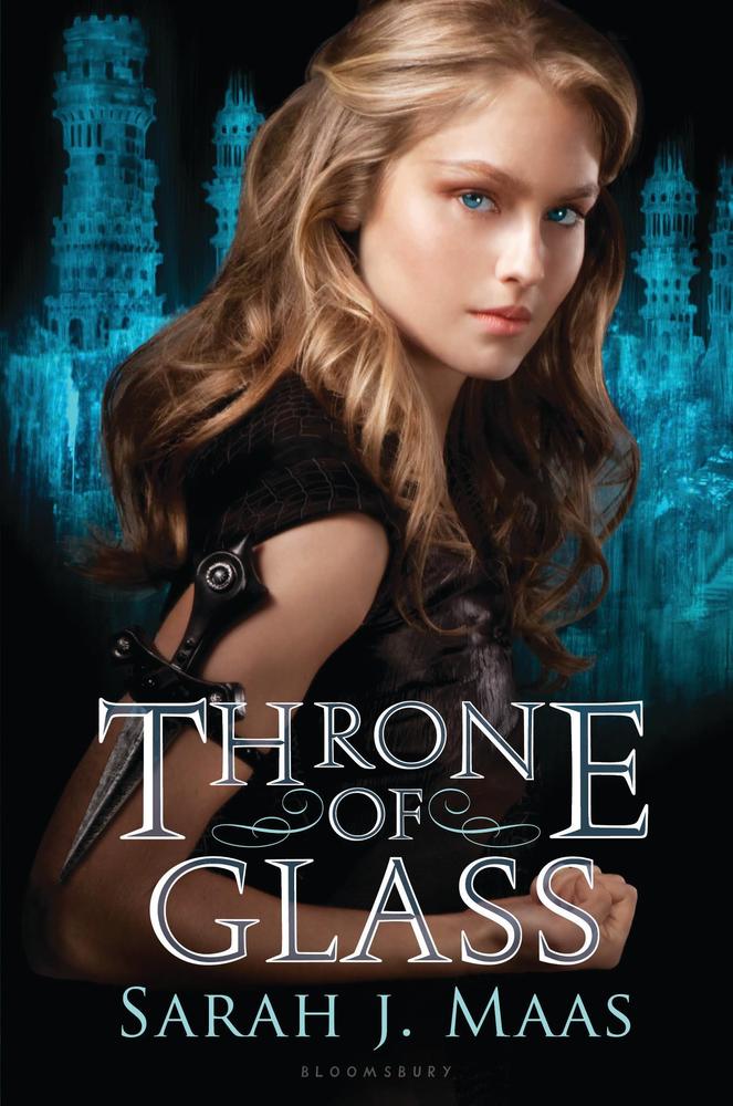
Maureen Johnson, author of several books including 13 Little Blue Envelopes and The Name of the Star, has written an article for HuffPost about how the gender of the author affects the cover of their book. It is a great article, and throws up some very interesting points.
Initially, it struck me as similar to the whole giving children's books 'adult' covers à la Harry Potter.
It's like giving adults a legitimate disguise to their 'embarrassing' reading habits. As if that douchebag on the bus is going to point and laugh at you less than they would have before for reading the adult-covered version.
And another argument that will often be cited is that some books will naturally be aimed at certain demographics. Therefore the covers are going to convey that.
But both of these arguments dismiss the point that books penned by women often get flowery, 'girly' covers that could cover up deep/dark themes and/or literary masterpieces. From the coverflips submitted to Maureen Johnson (see an example below with the original on the right, and the coverflip on the left), an overriding theme of covers from female authors is a stock photo of a girl, either face hidden or looking longingly out of the cover, both often in soft lighting and/or focus.
John Green gave his two cents saying that he had to fight for the cover of TFiOS. While his triumph is great for the publishing world in general (i.e. it shows that an abstract cover with little hint to the story within can still become a bestseller), some could/would say that he was always more likely to get his way because he is male, and male authors can often have more abstract or dark covers.
Considering that some of the best-selling authors in the past decade have been female - JK Rowling, Hilary Mantel, Suzanne Collins, Stephenie Meyer, EL James*... - it should signal the change in tides for covers to not give away the gender of who wrote the book, but reflect the content. And of those authors I mentioned, three of them have (I like to think...) relatively gender-neutral covers for their books.
Obviously, part of the problem stems from the fact that in our society, it is not considered 'normal' or even 'right' for a man to be seen doing things that are considered girly or feminine. This, of course, includes being caught reading a book that may be construed as a girl's book. The old adage of "don't judge a book by its cover" is nigh-on impossible to keep, because that is exactly what a cover is setting out to do: help you make a snap judgment on whether that book would appeal to you or not. So a man sitting on the train is not always going to feel comfortable reading a book which is covered in flowery, soft-focused imagery that screams "I'm reading a book aimed at women!"
With the increasing movement behind equality for everyone, I do believe this type of subtle sexism and misogyny will start to become a thing of the past. And people can read a book because it interests them, with no fear of being ridiculed. That's what I hope anyway.
*Yeah, it may be a trashy novel, but doesn't take away from the fact it's a bestseller.


Don't forget the fact that J.K.Rowling had to go by J.K. purely cause she's a woman, so as not to deter boys from reading Harry Potter (despite the main character being a boy).
ReplyDeleteReally cool seeing the coverflips. Definitely have to say that 9 times out of 10 the "gender neutral" covers look more intriguing and interesting. Hopefully publishers will learn one day... :)
Exactly. A lot of the time, I found the coverflips to be more eye-catching and more likely to make me pick up and read the blurb, which is surely half the battle.
DeleteAnd yeah, the whole thing about a lot of female authors being told to initialise so they won't deter male readers... does that even work? I assume initialled names are female now.